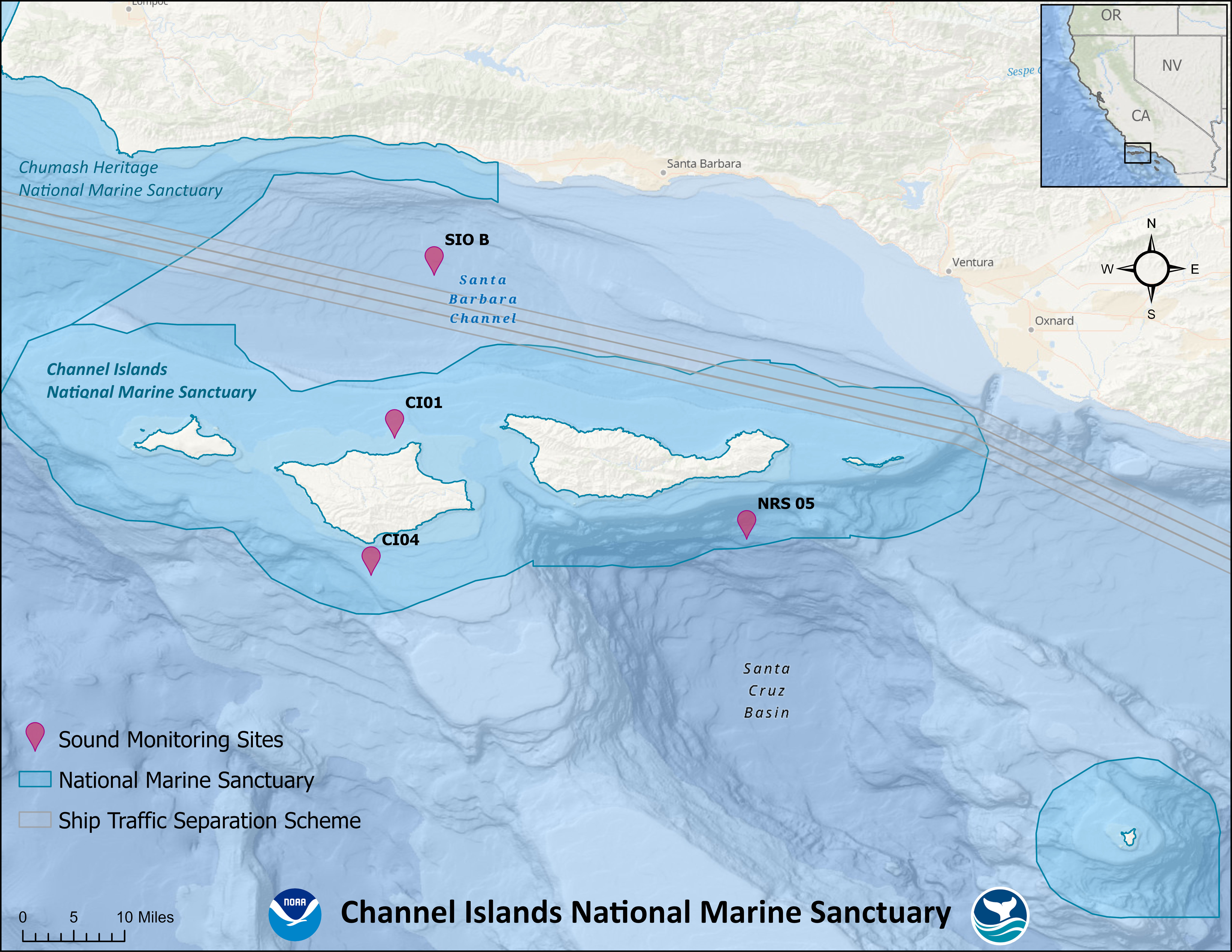
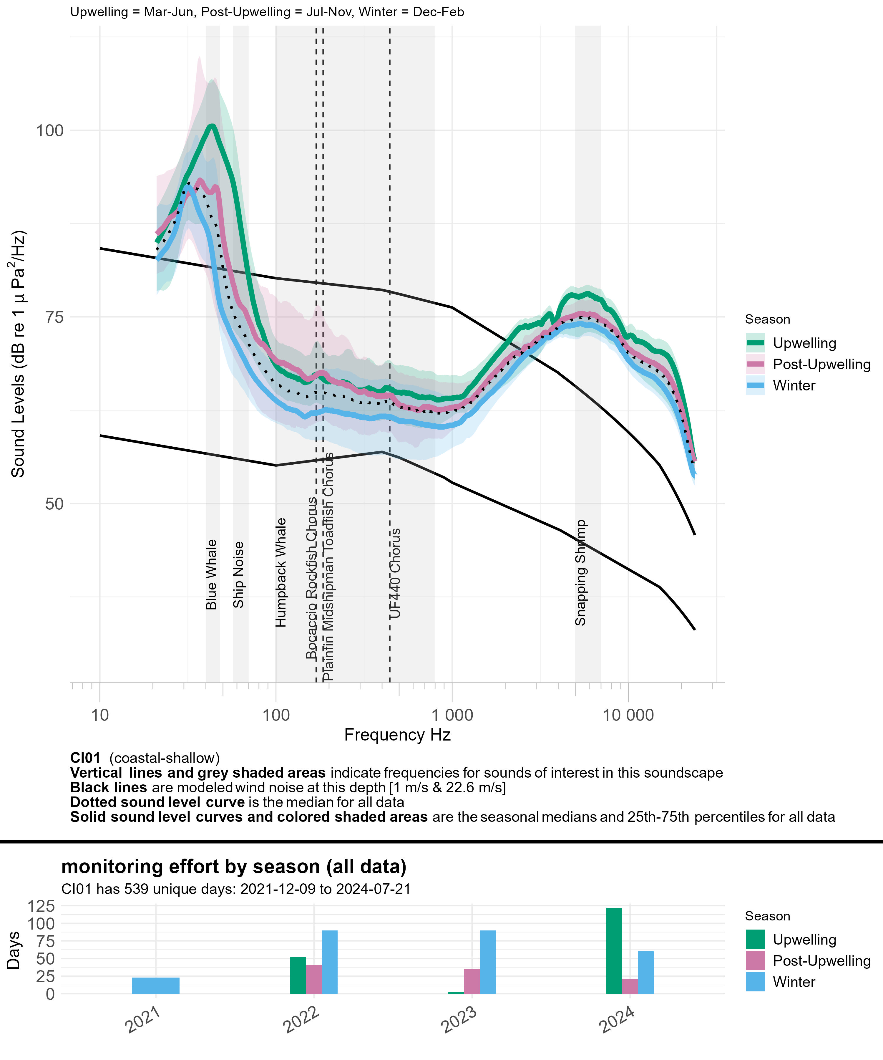
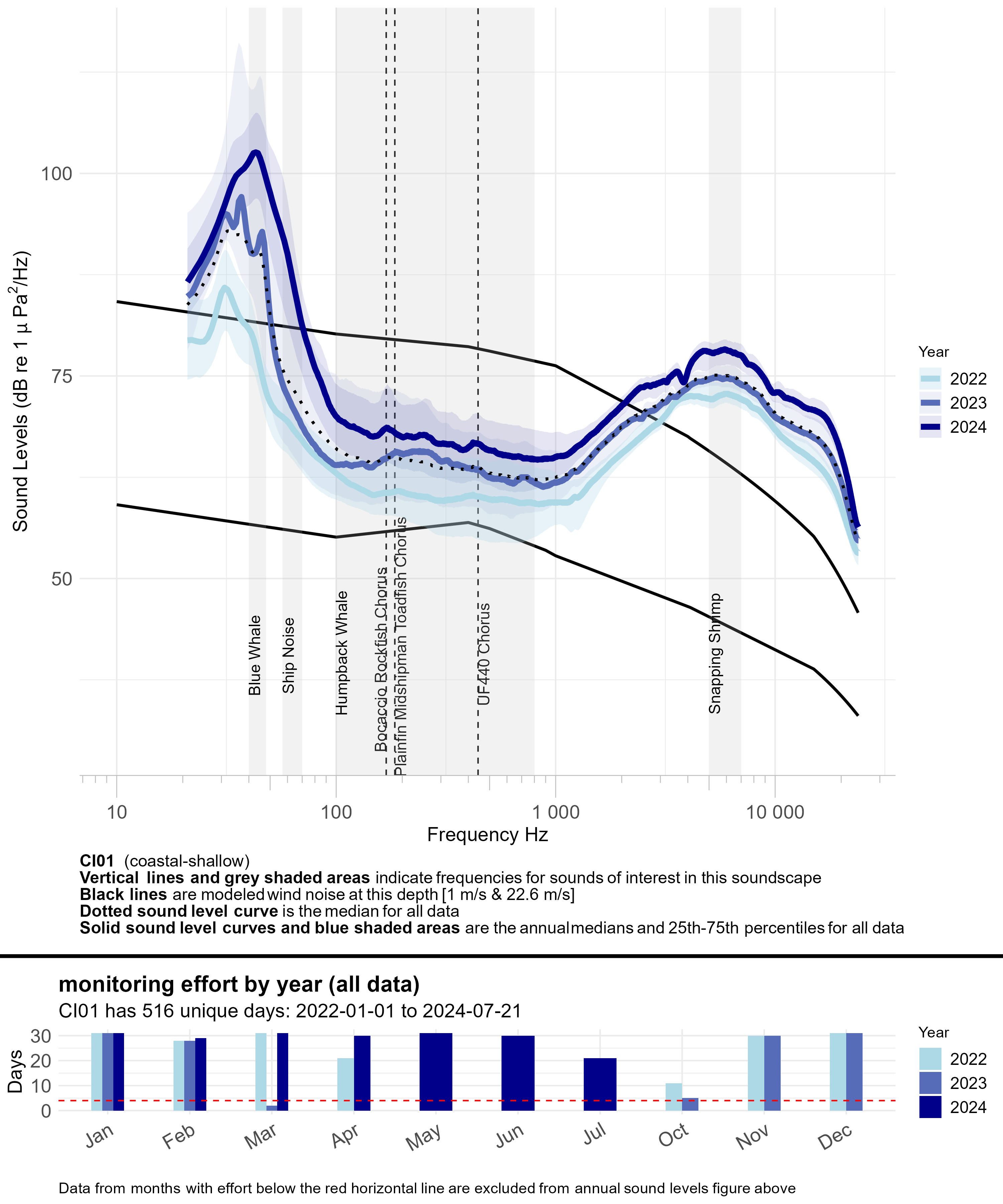
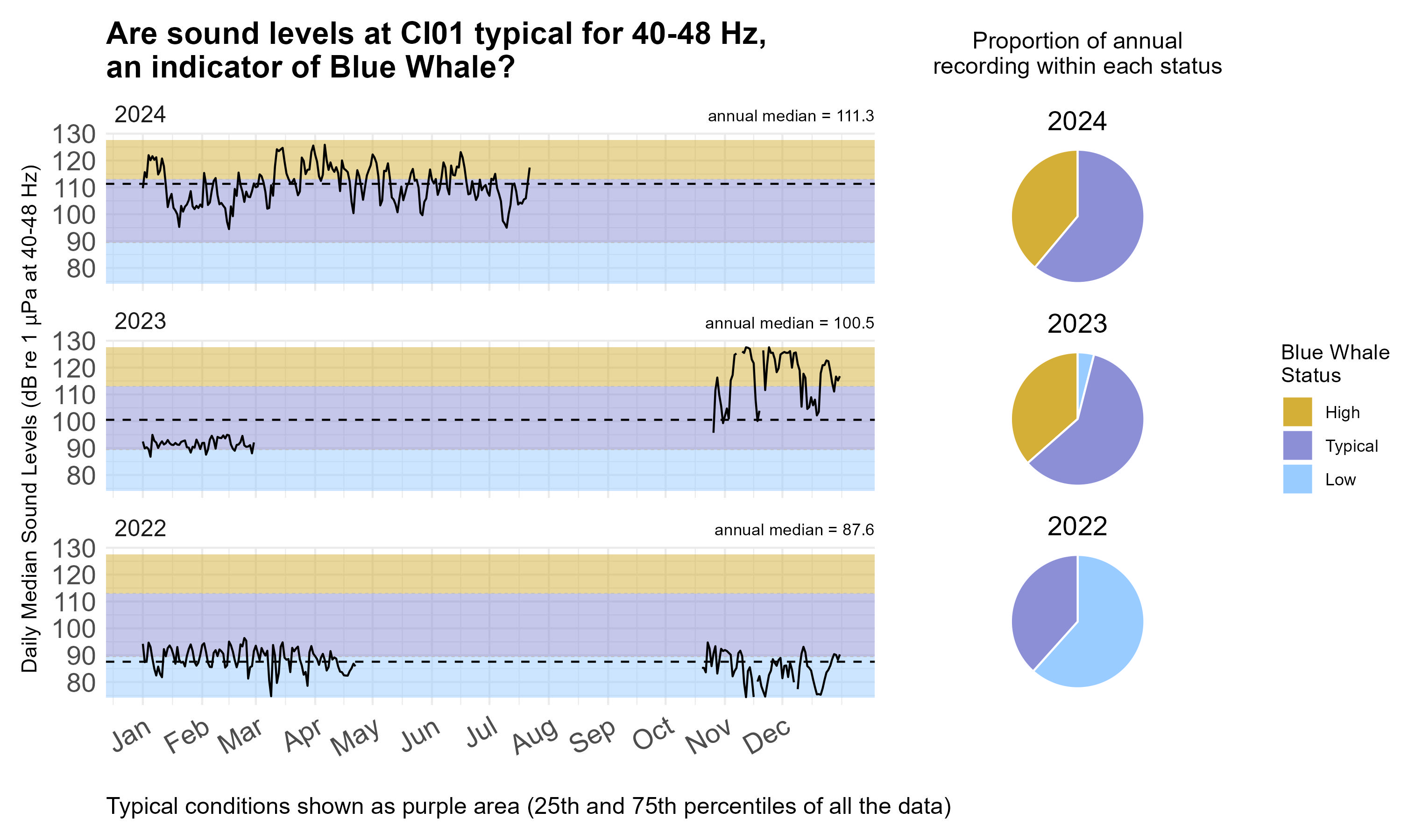
Channel Islands National Marine Sanctuary (CINMS) surrounds the five northern Channel Islands and is situated across the Santa Barbara Channel. Within the Channel, two powerful currents, the northbound Davidson Current and the southbound California Current, meet and respective warm and cool waters mix. That mixing combined with seasonal high winds make this region extremely productive. This productivity makes CINMS a global foraging hotspot for marine life, like whales and fish. The CINMS region consistently has some of the highest reports of commercial fishing value and volume. At the same time, this region is also home to consistent commercial ship traffic transiting through established Traffic Separation Schemes, acting as major highways for large vessels. Much of the region is also inside a Naval Testing and Training area, and Vandenberg Space Force Base has significantly increased launch activities that go over CINMS since 2024.
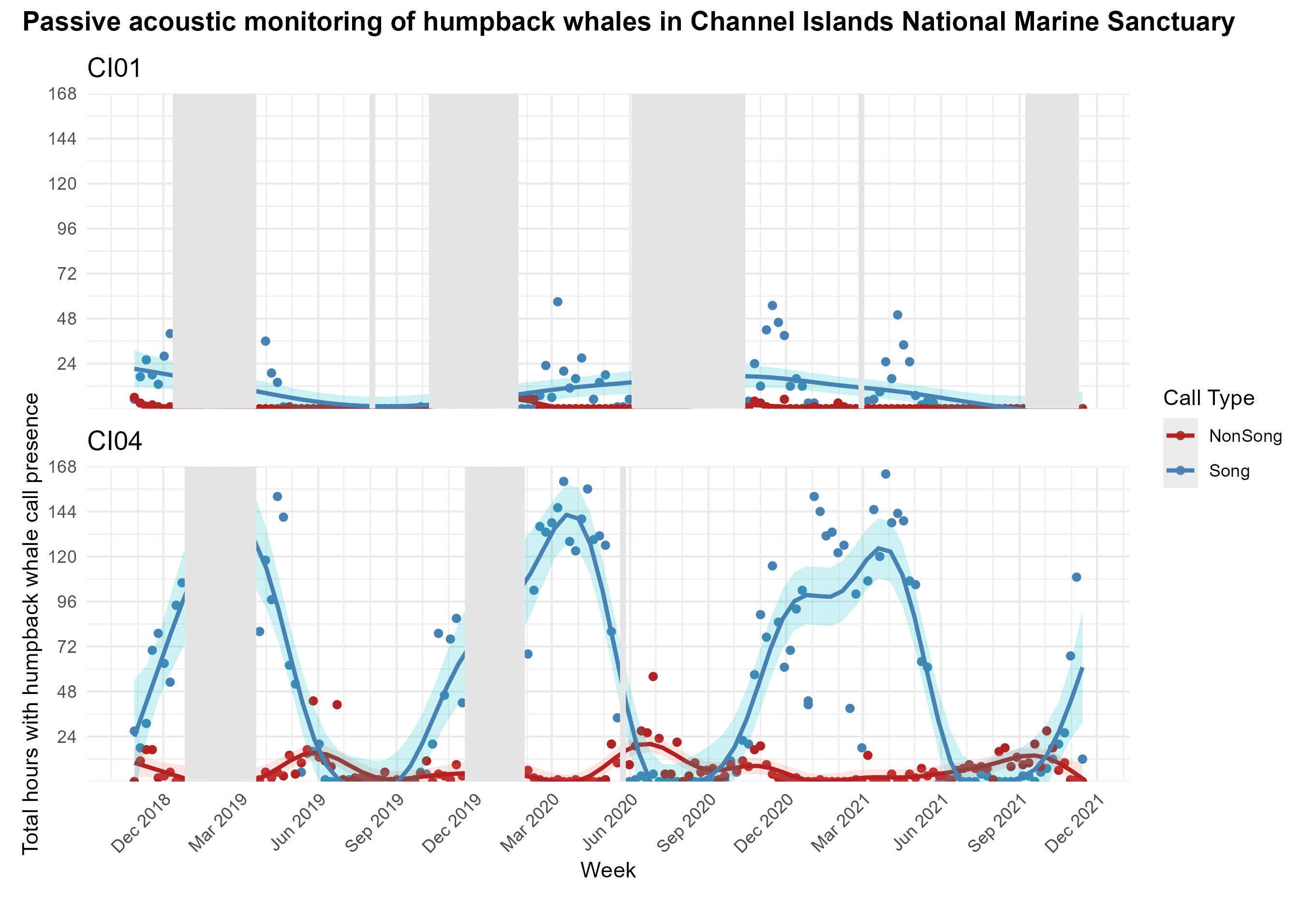
This region’s biological and human activity has been monitored using passive acoustics for decades. For context, a Noise Reference Station has been in place behind Santa Cruz Island since 2014. Additionally, the Scripps Institution of Oceanography has monitored underwater sound across the Southern California Bight for many years, including at Site B in the Santa Barbara Channel (see map below). This station provides noise measurements to the shipping industry annually during voluntary slowing periods. CINMS began monitoring sanctuary soundscapes in 2018 with the establishment of CI-01 and CI-04, located north and south of Santa Rosa Island. Furthermore, the Woods Hole Oceanographic Institution maintains a near real-time buoy that provides large baleen whale detections at whalesafe.com.
To see historical CINMS monitoring sites that are no longer active, please visit Sanctuary Soundscape Project data portal.