Since 2015, NOAA Pacific Marine Environmental Laboratory (PMEL, OAR) and National Marine Fisheries Service (NMFS) Ocean Acoustics Program have been monitoring underwater sound at the long-term oceanographic sampling site, Ocean Station Papa. The NOAA Noise Reference Station (NRS02) was established to sample baseline data to determine seasonal patterns and trends of marine mammal acoustic presence, anthropogenic activity, and links between ocean sound and environmental conditions. Previous cross-disciplinary research using these data focused on impacts from marine heatwaves (Kohlman et al, 2019) and changes in vessel noise related to the COVID-19 pandemic (Dziak et al, 2025).
Gulf of Alaska Soundscape Report
Ocean Sound Monitoring
Summary of monitoring sites
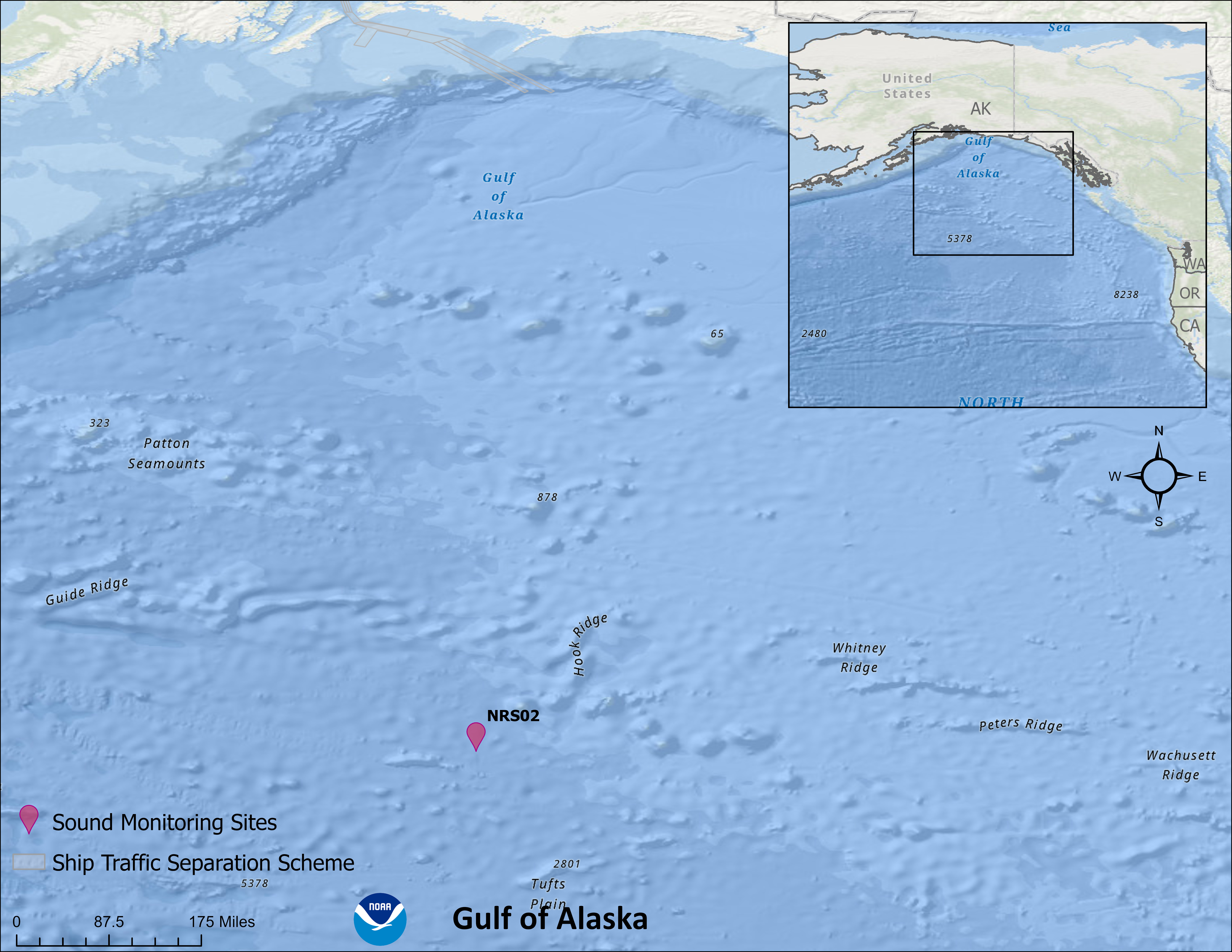
| Long-term Monitoring Site | Primary Monitoring Purpose | Oceanographic Setting | Depth (m) | Sampling Rate (kHz) | Known Biological Sounds | Vessel Traffic Setting | Latitude (°) | Longitude (°) | Start Date | Total Recording Days | Funding Partners |
| NRS02 | To monitor long-term trends in ocean noise, particularly from vessels and baleen whale species presence. | offshore-deep | 500 | 5 | baleen whales | Large vessel traffic | 50.2 | -145.1 | 1/2/2015 | 2224 | NMFS, PMEL |
Ocean Sound Conditions
Soundscapes vary across years, seasons, and even within a day. Differences are driven by shifts in wind and weather patterns, migration and behavior of animals, and patterns in human activities. We track how sound levels change in different frequencies using standardized soundscape metrics to understand these changes. Seasonal and annual percentiles of all the data are used to define typical conditions.
What are the seasonal patterns across frequencies?
Season is often a main driver of soundscape differences: wind and weather patterns shift, species migrate or change behavior, and humans change their marine activities. As shown on the graphic(s) below, we can visualize the differences by looking at the variation across frequency (pitch of the sound in Hertz/Hz) shown on the x-axis and intensity (how loud the sound is in decibels) shown on the y-axis. The colored lines represent regionally-specific oceanographic seasons, vertical dashed lines and grey shaded areas are the frequency ranges that a sound source of interest can be heard at, and the black lines bound the expected range of modeled sound intensity when only wind noise is present. Each monitoring site has been categorized according to oceanographic setting: shallow is <200 m depth, deep is >=200 m depth, coastal is <25 nm from shore, and offshore is >=25 nm from shore.
Here are some questions to consider when viewing and interacting with the graph(s) below:
(1) Which season has the highest sound levels?
(2) Are there peaks in the sound levels for any of the sounds of interest?
(3) Are the low-frequency sound levels outside the expected range for wind noise?
Here are some questions to consider when viewing and interacting with the graph(s) below:
(1) Which season has the highest sound levels?
(2) Are there peaks in the sound levels for any of the sounds of interest?
(3) Are the low-frequency sound levels outside the expected range for wind noise?
Seasonal median sound levels (measured by mean-square pressure in micropascal squared per Hz) across a range of frequencies (~10 to ~24,000 Hz) at a given monitoring site, with annual recording effort represented by a bar graph underneath. Each season is a different colored line. Solid black lines show modeled ambient sound levels from wind at 1 m/s (lower line) and 22.6 m/s (upper line) based on hydrophone depth. Frequency bands indicative of a biological or anthropogenic sound source of interest are highlighted in semi-transparent gray and labeled; peak frequency for dominant fish species are labeled with vertical dashed lines. Credit: Megan McKenna and Emma Beretta/CIRES and NOAA
How are ocean sound conditions changing across years?
We can track changes in ocean soundscape conditions and its contributors by comparing annual sound levels. Efforts to reduce noise impacts to marine animals are underway on local to global scales. Strategies can include avoidance of times and areas when sensitive species are present to reduce vulnerability (e.g., a shipping lane), changing the operation of a potentially hazardous noise source (e.g., by slowing and therefore quieting vessels) or through the design and use of alternative, quieter sources (e.g., new, quieter ship design and/or technologies). The effectiveness of these approaches, and the scales over which they are effective, can be tracked through comprehensive monitoring efforts. A focused analysis is often necessary to tease apart the multiple drivers of ocean sound levels, however, annual summaries provide initial insights to overall patterns.
Here are some questions to consider when viewing the graph(s) below:
(1) Are levels lower in the most recent year of monitoring in any of the frequencies of interest?
(2) Are there peaks in the sound levels for any of the sounds of interest? Do they differ across years?
Here are some questions to consider when viewing the graph(s) below:
(1) Are levels lower in the most recent year of monitoring in any of the frequencies of interest?
(2) Are there peaks in the sound levels for any of the sounds of interest? Do they differ across years?
Annual median sound levels (measured by mean-square pressure in micropascal squared per Hz) across a range of frequencies (~10 to ~24,000 Hz) at a given monitoring site, with annual recording effort represented by a bar graph underneath. Each year is a different blue line, getting darker for every additional year of data. Solid black lines show modeled ambient sound levels from wind at 1 m/s (lower line) and 22.6 m/s (upper line) based on hydrophone depth. Frequency bands indicative of a biological or anthropogenic sound source of interest are highlighted in semi-transparent gray and labeled; peak frequency for dominant fish species are labeled with vertical dashed lines. Credit: Megan McKenna and Emma Beretta/CIRES and NOAA
Is the intensity (loudness) of sound sources of interest within typical range?
In some soundscapes, we can use specific frequencies as indicators for the presence of a source of interest (e.g. species presence and behavior). Monitoring sites are often chosen because a known source that we want to track is present and we can track this dominant sound energy contributor using their specific frequency or frequency range. For example, seasonal migration of humpback whales to Hawaiian Islands results in soundscapes dominated by their calling between 50 and 630 Hz. At sites near commercial shipping lanes, 63 and 125 Hz one-third octave level (TOL) are used as an indicator for ship noise (Haver et al. 2021). At sites where snapping shrimp are present, 4,000 - 18,000 Hz can be used as an indicator of their sounds. Only frequencies that have been identified as reliable for tracking a source of interest are shown below.
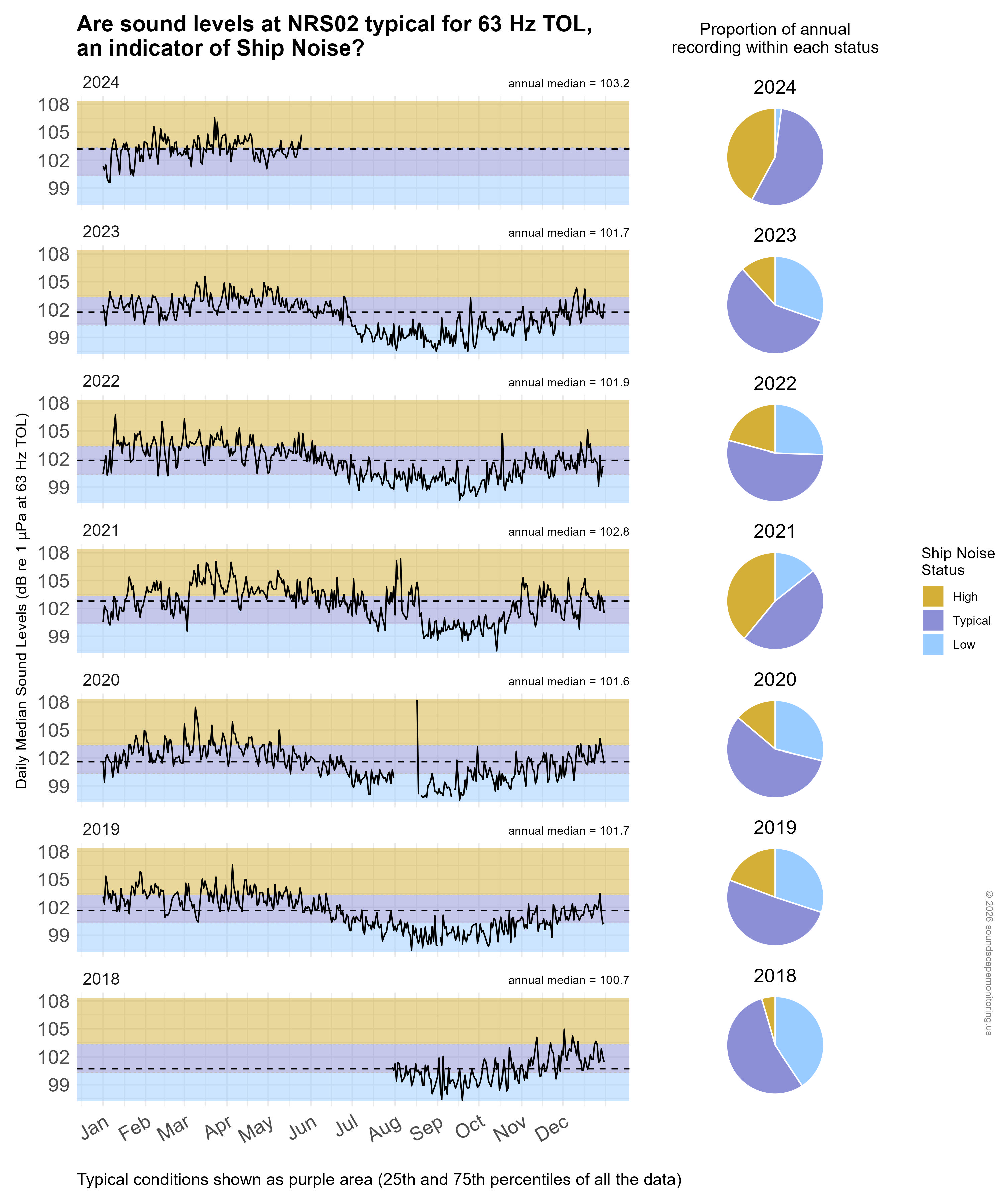
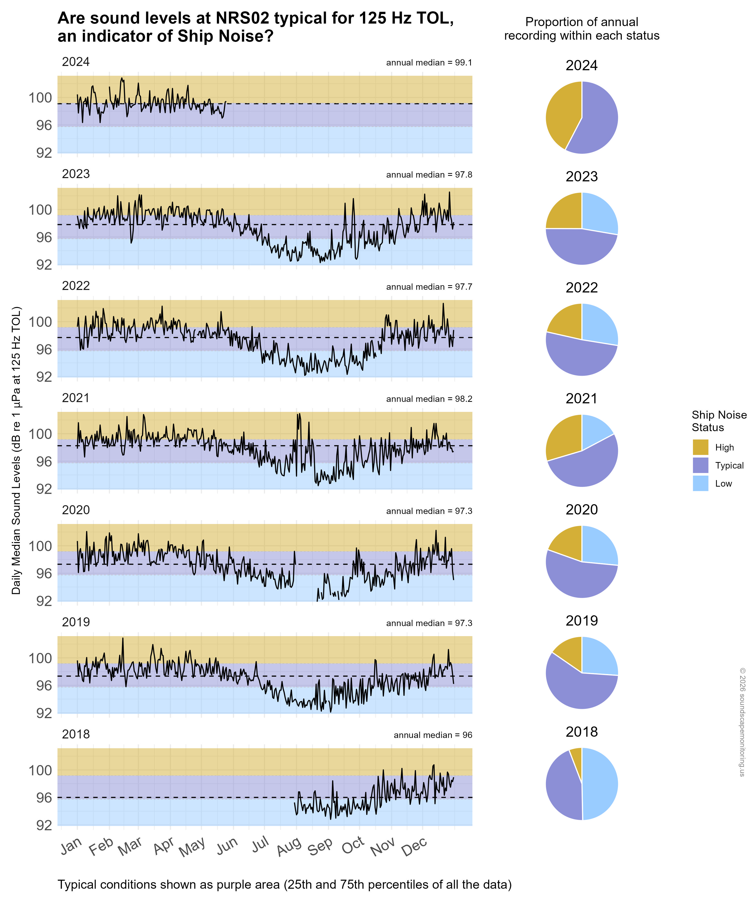
Time series plot of daily median sound levels (measured as dB re: 1 µPa) for a specific frequency band(s) of interest at this site, separated by year. Missing sound levels represent periods of time when data were unavailable. Background color shading (blue, purple, gold) indicates low (<25th percentile), typical (25-75th percentile), and high sound levels (>75th percentile) across this monitoring site's entire dataset (all years) at this frequency band(s) for comparability with annual medians, marked with horizontal black dashed lines. Pie charts on the right hand side of the graphic show the proportion of daily median sound levels that fell within each category for each year, following the same color-coding and percentile bins. Credit: Megan McKenna and Emma Beretta/CIRES and NOAA
Ocean Sound Indicators
We can use long-term monitoring of ocean sound to derive and track indicators of ocean conditions. These indicators track the status and trend of habitat condition, species presence, human-use patterns, and management activities. There are many analytical methods used to generate ocean sound indicators. Below are ocean sound indicators relevant to the sanctuary and available for condition tracking.
**Coming soon!**